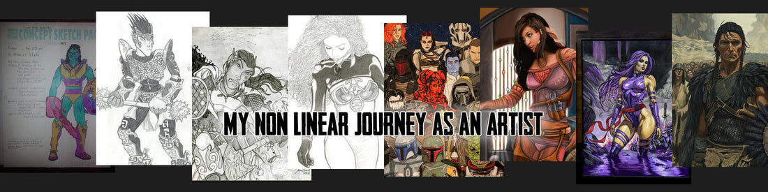
My non-linear Journey as an Artist
Introduction
Art has always been a part of my life—but not always a consistent one. Over the years, I’ve moved in and out of it depending on time, energy, and whatever season of life I was in. But in 2025, I made a decision: I would stop waiting for the right moment to create and start treating art as something worth prioritizing. I didn’t want another year to slip by without growth, exploration, and expression.
To help anchor that commitment, I decided to reflect on my artistic journey—the detours, the experiments, the breakthroughs—and document the path that brought me to where I am today. This blog post is a look back at that journey, told through the pieces I’ve created over the years. From pencil sketches in the late ’90s to digital paintings today, this isn’t a linear story of constant progress—it’s one of rediscovery, resilience, and the simple love of making things.
1997 – Age 14
Drawn on one of the “Concept Sketch Pages” from a comic character design workbook, this piece represents my earliest efforts at creating original characters. At the time, my friends and I were heavily inspired by superhero comics, and we’d use guides like How to Draw Comics the Marvel Way to build off the reference poses and body styles. Most of our creativity went into the costume designs and trying to make characters that felt cool to us—usually with oversized muscles and lots of belts or pouches, because of course they did. It’s rough, awkward, and exactly what 14-year-old me thought looked awesome.


This one’s a perfect time capsule of the era—and of my influences at the time. I was deep in the Rob Liefeld phase here: massive muscles, impossible anatomy, tiny feet (if any), and more ammo belts than any one person could realistically carry. It wasn’t about realism—it was about attitude. I remember obsessing over the “cool factor” more than proportions or anatomy, and characters like Cable or Deadpool were basically the blueprint. Cringe-worthy now? A little. But back then, this was exactly what I wanted to be drawing—and it laid the foundation for everything that came later.

I drew this after seeing the character in a video game magazine—Scud from Industrial Evolution. At 14, I wasn’t thinking about form, detail, or composition. I just liked how it looked and wanted to draw it. A lot of my early art came from that impulse: find something cool, grab a pencil, and try to put it on paper. Looking back, pieces like this remind me that even when I didn’t fully understand what I was doing, I was still developing the muscle of observation and the habit of drawing what inspired me.

This piece shows a female character I “created” when I was 15… though to be completely transparent, it’s almost a direct copy of a Jean Grey pose from an X-Men comic. I flipped the image, changed the colors, and called it my own. It wasn’t done with any malicious intent—I was just a teenager trying to understand how the artists I admired could make their work look so dynamic and polished. At the time, mimicking what I saw felt like the only way to figure it out. This was me trying to walk before I knew how to stand, and while it’s clearly derivative, it also marked one of the early moments where I started pushing beyond just admiration into aspiration.

This was my pencil illustration of a fantasy version of my best friend’s original character—one of the earliest drawings I can find where I really tried to make something original from start to finish. The pose and anatomy weren’t quite there yet, but the effort I put into the shading and rendering shows that I was starting to take the craft more seriously. It’s clear I’d been practicing, even if I didn’t have all the tools yet. Also… that hairstyle? Absolutely timestamped. Nothing says “late ’90s” like that comic-meets-boy-band look.

This pencil drawing of Sarah Michelle Gellar is the earliest example I can find of me trying to draw something realistic instead of stylized or comic-inspired. Up until this point, most of my art was exaggerated, idealized, or flat-out fantastical—but here, I was actually trying to study a real person’s face and get the features right. It was a big shift in mindset for me, even if I didn’t realize it at the time. Looking back, it marked the start of an interest in realism that would come and go in waves throughout my artistic journey.

This pencil drawing, which I titled Scotsman at the time, was probably inspired by some barbarian artwork I’d seen—likely from Magic: The Gathering or something in that vein. I don’t remember the exact reference, but the influence is definitely there. What stands out to me now is the technical improvement—the proportions were getting better, the shading was more confident, and I was clearly trying to add more texture and depth. This one felt like a step forward, even if I didn’t fully realize what was working and what wasn’t just yet.

Okay… this one’s rough. The character design is entirely original—but not in a good way. The proportions are off, the color choices are painful, and there’s a lot here that makes me want to hide behind a drawing glove. But—this was my very first attempt at digital coloring, and that makes it worth remembering. It was definitely done with a mouse, and it shows. Still, it marks the beginning of my experimentation with digital tools, and for better or worse, that opened up a whole new world. Everyone’s got that one piece they love to hate—this is mine.

This original character was inspired by The Death Gate Cycle—specifically the imagery of Haplo’s runes, if I’m remembering right. Something about the mysticism and layered symbolism in that series really stuck with me, and it started to influence the way I approached original character design.

This pencil drawing of the band Nickelback—based on their Silver Side Up era—was one of my early attempts at drawing a group of real people with a focus on realism. At the time, I thought it turned out great, and honestly… I still do. It marked another step forward in capturing likeness and facial structure, and it felt like a big accomplishment. Also, let’s be real: this was back when everyone loved Nickelback, so drawing them felt like the perfect mix of pop culture and practice.

This quick, small-scale pencil portrait of Tom Green came together faster than most of my drawings at the time—and I remember feeling surprisingly impressed with myself when I finished it. It wasn’t part of any major project, just something I did on a whim. But for whatever reason, it clicked. The likeness was there, and even though it was small and simple, it gave me one of those first quiet moments of thinking, “Hey… maybe I can actually do this.” A little win that meant a lot at the time.

By 2002, I was deployed to Kuwait, and while life was a whirlwind, I eventually found time to draw again. Without access to reference material, I had to rely entirely on imagination—which pushed me to start creating more complete scenes with multiple characters or actual backgrounds. The results were definitely mixed, but I remember being proud of these pieces at the time. They gave me solid practice with pencil shading and scene composition. One standout from this period was this dark elf with the shield and axe—a character I’ll revisit in color years later.


I only have a couple drawings from 2003, but they both feel important in hindsight. One shows me stepping outside my comfort zone, attempting more dramatic perspective—something I’d often avoided up to that point. The other, while unfinished, stands out as one of the first times I created a character that felt like they could’ve stepped out of a novel. Not just a cool design, but something cohesive and natural, like a person who belonged in a real story. This was the year I started thinking more about who I was drawing, not just what they looked like.


This unfinished pencil portrait of Natasha Marley was based on one of her photoshoots from Playboy. What made this piece unforgettable, though, was that she saw it—and loved it. She reached out to say it was the wallpaper on her desktop and that she’d even shown it to her mum. At that point in my life, that kind of response meant everything. I wasn’t thinking about making prints or building a portfolio—I just wanted to draw something beautiful. Hearing back from the subject herself was one of my earliest brushes with validation as an artist, and I absolutely loved it.

This piece marks a turning point for me—it was the year I started using reference models more seriously in my art, and it made a huge difference. I realized how much more natural my work could feel when I wasn’t just guessing. But maybe more importantly, this was also when I discovered something I loved drawing: hair. The flow, the texture, the way it frames the face—I could get lost in it. This drawing remains one I’m proud of, and I’ll be sharing my attempt at coloring her the following year.

In 2005, I got my hands on my first graphics tablet and an early version of Photoshop—and everything changed. This was my very first attempt at digitally painting the drawing I’d done the year before, and it felt like opening a door to an entirely new world of possibilities. Not long after, I drew Cara the Mord-Sith from the Sword of Truth series I was reading at the time and gave digital coloring another go. In hindsight, the anatomy definitely needed work, but at the time, I was completely absorbed in the process of bringing characters to life with light and color instead of just graphite. It was clumsy, but exciting—and I was hooked.


This original character drawing closed out 2005 and carried me into 2006, and honestly… she still holds up in my eyes. I went for a close-up in the foreground with a full-body version in the background, complete with an actual environment—something I hadn’t always had the confidence to do. There was a sense of flow in this piece that made me feel like I was hitting a rhythm, like all the things I’d been practicing were finally clicking into place. For a while, it really felt like I was on a roll.

This was the last piece I managed before life pulled me away from art for a while. Inspired by the sword-and-sorcery aesthetic of characters like Red Sonja, this drawing let me lean into fantasy themes I’ve always loved—strong characters, bold poses, and just a touch of attitude. Looking back, I can see the areas that needed more development, but I still like the energy in this one. It marked the end of a chapter for me creatively… at least for a while.

After some time away, I found my way back to art in 2007 and managed to complete a few pencil drawings that felt like solid returns to form. One was based on a reference of male model Jason Baca, reimagined as an elven ranger—he actually loved the depiction, which was a great surprise. Another was a fantasy portrait of a fellow Elftown user, part of a growing habit of turning internet friends into characters. The last piece from this stretch was an unfinished drawing of another Elftown friend, listening to her iPod while singing—something soft and personal that still means a lot, even in its incomplete state.


2007 – A Character Worth Returning To
This pencil drawing of an original character remains one of my personal favorites from that year. Something about the pose, expression, and overall vibe really clicked for me at the time—and still holds up in my eyes today. I poured a lot into this one, and even though it was just graphite on paper, it felt like I’d captured something solid. I’ll eventually come back to this character years later to give her the full color treatment she deserves, once my digital skills catch up to the vision I had in my head.

2007 – My First Fully Digital Artwork (and It Shows)
This was my first attempt at creating an image entirely digitally—from blank canvas to finished piece. It’s… not good. The anatomy is a mess, the shading is muddy, and the colors are all over the place. But it’s mine. And as cringey as it is to look at now, this piece represents the moment I stopped just experimenting and actually started learning how to create in a fully digital space. Everyone starts somewhere—this was my start.
Digital Piece #2 – Immediate Growth
Not long after that first flop, I gave it another go—and the improvement was dramatic. This second digital piece actually felt cohesive. The brushwork made more sense, the anatomy was tighter, and the overall presentation was something I could feel proud of. It gave me the encouragement I needed to keep exploring digital painting.
Digital Piece #3 – A Kind of Self-Portrait
This next piece was a bit more personal. Loosely inspired by myself, it wasn’t meant to be a literal self-portrait, but something reflective of how I was feeling at the time. It marked one of the first times I tried to inject emotion and introspection into a digital piece, rather than just technique.


2007 – Sorcerer Soldier (First Foray into Mixed Media)
This piece marks my very first attempt at mixed media and photo manipulation. I used a photo of a friend from the Army and transformed him into a sorcerer—robes, glow effects, and all. It was part photo editing, part digital painting, and part raw experimentation. The end result was rough around the edges, but it represented a major step outside my usual comfort zone. It was the beginning of me exploring new techniques, blending photography with illustration, and realizing that there was more than one way to bring a vision to life.

2008 – Bridging Traditional and Digital
These two pieces from 2008 started as pencil drawings and then made the leap into Photoshop for digital coloring. The first—a completely original creature—was one of my early experiments with designing fantasy animals and trying to bring them to life with digital textures and shading. The second piece is another self-portrait of sorts, imagining myself as a fantasy warrior or knight. You can even see from the screenshot that I was working in an old version of Photoshop—layer by layer, still figuring it all out. These works represent a growing confidence in combining traditional drawing foundations with digital tools to push my art further.


2009 – Return of the Dark Elf
Back in 2002, I sketched this dark elf with a shield and axe while deployed in Kuwait. In 2009, I brought him back—this time into Photoshop for a full digital color treatment. It felt like a meaningful revisit: taking something I’d imagined years earlier and giving it new life with the tools and experience I’d gained since then. I remember feeling genuinely happy with how it turned out at the time. It wasn’t just about coloring an old drawing—it was about seeing how far I’d come.

2012 – Back in the Game (and Something Just Clicked)
After a long break where life took priority, I found myself in a better place—and finally had the time and energy to come back to art. This quick speedpaint was just meant as a warm-up, but it surprised me. Even after the gap, something had clicked. My understanding of light, color, and digital tools had matured, even if I hadn’t been actively practicing. Sometimes time away lets ideas settle, and this piece felt like proof that I hadn’t lost anything—I’d just needed space to come back stronger.

2012 – “Stumpy” Sandtrooper (First Vector Experiment)
This was my first time experimenting with Adobe Illustrator and vector graphics, and I went in a totally different direction from my usual style. I ended up creating this clean, stylized version of a “stumpy” Sandtrooper from Star Wars, and I was surprised by how polished it looked. Illustrator felt like a whole different world compared to Photoshop or pencil sketching—less expressive, but really satisfying in its own way. It was a fun detour into clean lines, shapes, and design thinking, and it showed me how versatile digital art could be.

2012 – ARC Trooper Study (Leaning into Technique)
This fully digital painting of a Star Wars ARC Trooper was done entirely in Photoshop, and it marked a moment where I was intentionally trying to push my technique further. The style leans a bit animated, with bold shapes and clean color, and I gave it a full background to really bring the scene together. It felt like one of my most “complete” digital pieces at the time—not just a character study, but a full composition. I was still learning, still figuring out how to balance polish with personality, but this one felt like a meaningful step forward.

2012 – “Vader’s Chosen” Hand-Painted Ornaments (Daily Deviation & Rancho Obi-Wan Feature)
This project marked a return to traditional media, as I hand-painted a series of Star Wars Christmas ornaments using acrylics. Among them, the "Vader’s Chosen" set, featuring all the bounty hunters from The Empire Strikes Back, holds a special place in my heart. Not only did this set earn a Daily Deviation on DeviantArt—a significant feature that highlights exceptional artwork—but it also found a home at Rancho Obi-Wan in California, the world's largest private Star Wars collection. It's incredibly rewarding to see a personal, handcrafted project receive such recognition and become part of Star Wars history.

2012 – Kitbashed Sci-Fi (Photo Manipulation + Digital Painting)
This piece marked another big leap in technique—a hybrid of photo manipulation and digital painting. I constructed this sci-fi soldier using tons of mundane images: gadgets, hardware, bits of unrelated tech… anything I could repurpose. I transformed, layered, and lit them in Photoshop to create a cohesive character design, then painted over the whole thing to bring it to life. I don’t remember how many layers or pieces it took, but the process felt like building something out of spare parts—kitbashing with pixels. It was a completely different way of thinking about art, and it really expanded how I approach design.

2012 – Fighter Pilot (When Style and Substance Clash)
This digital painting is one I have mixed feelings about. I set out to paint a sci-fi fighter pilot climbing into her ship, and I still really like how she turned out. But backgrounds have always been a struggle for me, and my lack of experience with spacecraft design really shows here—the environment feels clunky and out of place. On top of that, I had just discovered Photoshop’s “styles” and layer effects… and I leaned hard into them. Rather than learning how to manually paint the visual effects I wanted, I fell into the trap of relying on digital tricks that didn’t quite fit the image. It’s not a failure—it’s a snapshot of trying, experimenting, and learning what doesn’t work. In the end, I probably would’ve grown more by focusing on fundamentals instead of shortcuts. But every misstep still moves you forward.

2013 – Trying Too Hard (and Learning the Hard Way)
At first glance, this was probably one of the best-looking digital pieces I’d created up to that point—but it also highlights a lot of the issues I was working through as an artist. I was determined to produce “good” digital art, so I threw everything I had at it: stock images in the background, stamp brushes, polygonal shapes, and lots of layer styles. I spent way too much time trying to make the character’s face semi-photorealistic… but then didn’t carry that same rendering into her outfit or the rest of the scene. The end result has this weird tension—parts that look overworked sitting next to parts that feel underdeveloped. I was overcompensating with Photoshop tools instead of actually learning how to paint the things I wanted to see. Still, it’s a snapshot of a stage we all go through: chasing polish before mastering fundamentals.

2013 – A Personal Favorite (Right Track, Wrong Time)
This is easily my favorite piece from 2013—and probably my favorite original character I’ve ever created. I finally managed to paint a full digital piece that felt cohesive. The style held together well, the lighting worked, and while I probably still gave her face a little more attention than the rest, it didn’t feel out of balance this time. It felt like I was finally on the right track with digital painting—things were starting to click. Ironically, I didn’t do much digital work for a while after this. Life pulled me in other directions again. But this piece remains a personal milestone—a moment where my ideas and skills finally aligned.

2014 – Darth Revan Bookmark (Fun with Light and Glow)
I didn’t create much art in 2014, but I did paint this one piece of Darth Revan, formatted specifically to work as a bookmark. It’s not the most complex or breathtaking thing I’ve done, but it represents where I was with digital painting at the time—creating something from scratch, digitally, with no photo elements or shortcuts. I had a lot of fun playing with the lighting and contrast between the two differently colored lightsabers, and it reminded me how satisfying it could be to take a simple concept and see it through to the finish.

2014 – Revisiting an Old Favorite (Finally Feeling at Home Digitally)
This was one of the most rewarding things I created in 2014. I took a pencil drawing of a character I originally sketched back in 2007 (shared earlier) and brought her into Photoshop for a full digital color treatment. I kept the original pencil work on a “multiply” layer and painted beneath it, finally managing to preserve the drawing’s personality while giving it new life. I also used foliage brushes to build out a simple background, and while it’s subtle, this piece marks something more important: I was finally getting comfortable with the once-alien feeling of drawing on a tablet while looking at a screen. That awkward disconnect had faded, and for the first time, digital painting was starting to feel natural.

2014 – Star Wars Cosplay (A Bounty Hunter of My Own)
In 2014, I took a creative detour into the world of cosplay and armor building—specifically Star Wars. I designed an original bounty hunter character and pieced together a full set of armor using a mix of found parts, custom mods, and a lot of paint. It was hands-on, messy, and incredibly fun. While different from drawing or painting, the process still scratched the same creative itch: imagining a character, bringing them to life, and telling a story through design. It was a reminder that art doesn’t always have to live on paper or a screen—sometimes, it walks around.


2015 – Chewbacca in the Blizzard (Mixed Media & a Wookiee Encounter)
This mixed media piece of Chewbacca was a fun blend of scrapbooking paper, acrylics, and color pencil. I started by cutting Chewie out of brown textured cardstock, pasted him onto a white background, and then painted and drew in the detail—adding snow and blizzard effects to give it that icy Hoth vibe. I love how it turned out, but the coolest part by far? I got to give it, in person, to Joonas Suotamo—the actor who played Chewbacca in the newer Star Wars films. He loved it. That moment turned a fun experiment into an unforgettable memory.

2015 – Snowtrooper (Paper Sculpture Meets Mixed Media)
Building on the fun I had with my Chewbacca piece, I wanted to take things further—this time with depth and dimension. Using the same mixed media technique, I created this Snowtrooper entirely from layered, cut, and painted cardstock. But instead of laying everything flat, I used small tabs and folded paper to bring the figure off the background. The foremost arm actually extends closer to the viewer, and the overlapping pieces give the whole composition a sculptural, 3D effect. It was more sophisticated, more challenging, and incredibly satisfying to build—not just paint. This one felt like a true step forward in both craft and creativity.

2015 – Discovering Copic Markers (Mid-Project, No Less)
This Star Wars “Villains” poster was a big turning point for me—it started off as a hand-painted acrylic collage of various characters, but halfway through, I discovered Copic markers for the first time… and I was immediately hooked. I used them to finish the second half of the piece, and the difference in control, color blending, and speed was game-changing. Energized by the discovery, I went on to complete a matching “Jedi” poster entirely with Copics. These were my very first pieces using markers, and they opened up a whole new way for me to create—one I’d keep returning to for years.


2015 – Predator (Realism in Copic)
After working in a more comic-inspired style with my Star Wars posters, I wanted to see how far I could push realism using Copic markers. This Predator piece was the result. I started with detailed line art, then layered in the Copics to bring out texture, lighting, and depth. It was my first serious attempt at realism with this medium, and it made me appreciate just how versatile markers could be. Seeing this come together—from linework to final render—was a major confidence boost and a satisfying way to cap off a year of artistic experimentation and growth.


2016 – Sketchbook Originals (The Build-Up Year)
In 2016, I focused on designing new original characters—first in pencil, then inked in my sketchbook. These were all about building a cast, exploring personalities through design, and refining my inking skills. While I wouldn’t get around to coloring them until 2017, this was a year of groundwork—laying down strong foundations, experimenting with form and gesture, and reconnecting with the tactile feel of traditional tools. These drawings may have been black and white at the time, but they were full of color in my head, just waiting for the next stage.


2016 – Vector Portrait (Illustrator Feels Easy… But Not Quite Me)
This portrait marked my return to Adobe Illustrator for the first time since my 2012 “Stumpy Sandtrooper.” And honestly? It felt surprisingly easy. Something about the clean, deliberate nature of vector art just clicks with me—even if it’s not the medium I’m most passionate about. This piece turned out pretty awesome, and while I don’t work in vector often, it’s always fun to dip back in and see what I can create when I feel like switching things up.

2017 – Procreate, Apple Pencil, and a Whole New World
Getting my first iPad with an Apple Pencil in 2017 was a game-changer. It was the first time digital painting felt natural—pen to screen, no awkward disconnect, no second-guessing strokes. This is when things really opened up for me creatively. I revisited the characters I’d drawn in 2016 and finally brought them to life in full color using Procreate. They weren’t perfect, and I wasn’t where I wanted to be yet—but the colors matched, the elements worked together, and it marked the beginning of a more cohesive, focused approach to digital art. For the first time, I wasn’t just experimenting—I was building something with intention.


2017 – Two Wheels, Full Circle
This original piece was the first artwork I created and fully colored entirely in Procreate—and it just so happened to align with a new personal obsession: motorcycles. The style, energy, and subject matter all flowed together, and for the first time, I made real profit from my digital art. It was a successful piece in every sense—not just financially, but emotionally. It marked a point where my art and my interests collided in the best way possible. Even now, it holds a special place in my heart as a reminder of what can happen when everything clicks.

2020 – Back in the Saddle (After Life Hit Pause)
After a long gap spent launching a new career, working full-time on a degree, and renovating my home, art had to take a back seat for a while. It wasn’t until I found myself living in Puerto Rico in 2020 that I finally picked the brush back up—digitally, through Procreate. I created a new piece in the same spirit as my earlier motorcycle artwork, this time featuring a jaguar, and followed it up with two paintings of Instagram motorcycle influencers. It felt good to return with purpose—to paint what I loved, in a style I was proud of, and to reconnect with art after years of silence.


2021 – Precision & Polish (At a Cost)
In 2021, I focused on creating clean, crisp digital artwork in Procreate. Every line was intentional, every color flat and vivid, with no visible brushstrokes or painterly texture. The result was a highly polished look—meticulous, graphic, and visually striking, especially for those who appreciate that ultra-clean style. But while I was proud of how these pieces turned out, the process was incredibly time-consuming. Looking back, the pressure to maintain that level of precision actually slowed me down… and sometimes discouraged me from starting new pieces at all. It was a season of refinement, but also a reminder that how we create affects whether we create.


2022 – Painting What Matters (People and Painterly Progress)
In 2022, I stepped away from ultra-clean lines and embraced a more painterly approach—softer edges, visible brushwork, and more expressive rendering. The two pieces I completed that year are especially meaningful because they depict people very close to me. Using photo references, I focused on capturing not just their likeness but also their presence. Both paintings turned out well, and I was proud of the balance I struck between realism and artistic texture. These pieces weren’t just about technique—they were personal, and that made them all the more rewarding to finish.


2022 – First Time Sculpting in 3D (iPad to Print)
In 2022, I decided to try 3D sculpting on my iPad—and to my surprise, it clicked right away. Compared to my earlier, overwhelming peek at Blender on PC, this app made the process feel approachable and intuitive. My very first sculpt was a Native American skull warbonnet, and after putting in the time to shape and refine it, I 3D printed the final result. It was a proud moment—not just because of how it turned out, but because it showed me I could add yet another tool to my creative toolkit. I don’t sculpt often, but now I know I can.

2022 – First Time with Oils (Obi-Wan on Canvas)
This portrait of Obi-Wan Kenobi was my very first attempt at oil painting—and so far, my only one. I’d never worked with oils before, and while the process felt very different from what I was used to, I was happy with how it turned out for a first try. The blending and richness of the medium are incredibly satisfying, but I could tell right away that it’s something that requires a lot of patience and practice to master. I’d love to come back to oils one day when I have more time (and workspace) to really dig in.

2023 – Full Circle in 3D (Recreating a Scene with New Tools)
I didn’t have much time for art in 2023, but I did dive into something entirely new: 3D rendering with Daz Studio. I spent time learning how to paint textures for 3D objects and experimented with combining pre-existing assets with personal edits. The result was a reimagined version of one of my earlier pieces—my original character climbing into the cockpit of her starfighter. What started years ago as a 2D digital painting with clunky perspective and layer effects became a fully rendered 3D scene. Revisiting that moment from a new angle (literally and creatively) was incredibly satisfying, and it showed me how far I’d come—and how many ways there are to tell a story.

2023–2024 – The Mandobagger (Custom Motorcycle Build Inspired by The Mandalorian)
Between 2023 and 2024, I poured my creative energy into something a little louder than usual: a fully custom motorcycle build. I call it the Mandobagger—a Star Wars-inspired Indian Challenger painted and styled to honor The Mandalorian. The bike is coated in Alumaluster, the same special effects paint used for Mando’s beskar armor in the show, generously provided by Imperial Surface.
I designed a one-of-a-kind seat to mimic Mando’s flight suit, complete with leather accents, a replica bandolier, machined aluminum ammunition, and grav charge grenades. The Mudhorn signet is placed subtly on the right side of the tank to mirror his right shoulder pauldron. Every piece of paint, weathering, and detailing was done by me—including modifying my key fob to fit inside a custom-built bounty tracking fob.
The entire build is packed with subtle Star Wars references and personal touches, blending fabrication, design, and fandom into something entirely unique.
Check out @mandobagger on social media to see more of the build.


2024 – Blending Tools: 3D Reference to Traditional Finish
I didn’t create much art throughout most of 2024, but near the end of the year, I found time to get back into it with a hybrid workflow. I built a basic 3D scene in Daz Studio to serve as a reference for a traditional pencil, pen, and marker piece featuring Star Wars character Shin Hati. Using 3D as a planning tool helped me visualize lighting and composition, while the actual art stayed rooted in traditional media. It was a fun fusion of techniques—digital support for a hands-on finish—and a reminder that any tool can serve the creative process if you know how to wield it.


2024 – Psylocke (Markers, Acrylic, and a Paper Lesson Learned)
This Psylocke piece, done in markers and acrylic on 11x14 mixed media paper, reflects where my drawing skills currently stand—especially when I have the space to work in more detail. I was really happy with how this one turned out, but in hindsight, I learned an important materials lesson: mixed media paper isn’t ideal for fine marker work. The surface just doesn’t hold crisp detail the way Bristol does. I actually created this before the Shin Hati piece (which was done on Bristol), so this marks a kind of “last step” before leveling up my traditional workflow.

2024 – Star Wars Artist Trading Cards (Tiny Canvas, Big Fun)
In 2024, I discovered the world of artist trading cards—tiny, 2.5x3.5-inch pieces done entirely in traditional media on Bristol paper. I had an absolute blast creating a variety of Star Wars sketch cards in this format. What many people don’t realize is that official trading cards are usually based on much larger illustrations that get downsized to fit the card. Sketch cards, on the other hand, are created at size, so every mark counts. There’s no room for excessive detail—you have to be intentional and efficient. It’s a challenge I’ve really enjoyed, and one I’m looking forward to doing more of.


2025 – Style Experiments: Trying New Things to Find My Own
Kicking off 2025, I was inspired by two things: the playful, cartoon-like style of the mobile game AFK Journey, and the cool, frame-integrated compositions of a newly discovered art friend. I set out to create a series of small character illustrations on one large sheet of Bristol, planning to color them traditionally with markers. Unfortunately, the “recycled” Bristol I used turned out to be poor quality, and after completing just two pieces, I had to pivot. I brought a few of the drawings into Procreate and digitally colored them instead. The result was fun, and it was interesting to push myself stylistically—but it also helped clarify something: while I can appreciate these styles and enjoy the process, they’re not what I want my art to be defined by. And that’s just as valuable to learn.


2025 – First Time Using Polychromos (Markers + Colored Pencil)
This piece marks my first time using Faber-Castell Polychromos colored pencils—and I’m completely in love with them. I combined them with markers to create this artwork, building up the base with marker and then layering in depth, texture, and subtle gradients with the pencils. I’ve included three stages of the piece here to show the process: marker base, early pencil layering, and the finished result. It was a smooth and intuitive experience, and it instantly made me want to explore this mixed media approach further. It’s always exciting when a new tool clicks—and these definitely did.


2025 – The Malazan Project: A Year of Commitment and Growth
At the start of 2025, I made a promise to myself: this would be the year I stopped waiting for time to make art—and started making time for it. Too many years had slipped by where I created little or nothing, and I didn’t want that to be my story anymore. But for this to work, I needed real inspiration—something deep, meaningful, and motivating. I found it in my favorite book series of all time: Malazan Book of the Fallen.
I had created a few Malazan-inspired pieces in 2024, but 2025 was different. I committed to a full art project—dedicated to capturing the characters I loved as faithfully and creatively as I could. My goal was to gather as many visual and textual details as possible and translate them into paintings that fans of the series would immediately recognize and connect with.
In the early part of the project, I experimented heavily—testing different brushes, painting techniques, and workflows inside Procreate. I was chasing a process that felt natural, something that would let me paint what I saw in my head without getting in my own way. One of the early turning points was discovering the artist Haze Long. While our styles are very different, her structured workflow really spoke to me, and I decided to try her watercolor brush set. That—and a matte screen protector with a softer pencil tip—completely changed the feel of painting on the iPad. It finally felt like drawing on paper again.
From that point on, everything started to click. I could see the growth in each new piece, and more importantly, I felt more at home in my art than I had in years. Maybe my style will evolve again in the future, but for now, this process feels right. It feels like mine.

Conclusion
Looking back at this collection, I see more than just the evolution of technique—I see chapters of my life. Each piece carries something from the time it was made: a new tool, a new interest, a creative risk, or a turning point. Some of the art makes me cringe, some still makes me proud, but all of it is mine—and all of it is part of how I got here.
In 2025, with my Malazan art project in full swing, I finally feel like I’ve hit a rhythm. I’m not just chasing a style or testing new brushes—I’m painting with purpose, driven by stories that inspire me and a process that feels natural. I know my style will keep evolving, but for now, I’m exactly where I need to be.
Thanks for taking the time to walk through this journey with me.